Collaborative Project with Karen Cao (NYU MS Applied Statistics), Tana Wuren (NYU MS Applied Statistics), and Tina Koo (NYU MPH Global Health)
Introduction:
Definition of Hot Spots: Police departments frequently concentrate efforts in high crime areas. For example, under Operation Impact, the New York Police Department (NYPD) deployed additional officers into “Impact Zones”, neighborhoods with historically high patterns of crime. Similarly, a quick glance at data shows clear regions where NYPD focused Stop-Question-and-Frisk (SQF) efforts, and we define these areas as hot spots.
Objective: The primary objective of our study is to evaluate the effectiveness of hot spot policing by assessing the hit rate of the area with the highest number of stops, where:

Data: For this project, we restrict our analysis to 2013. From 2012 to 2013, there was a 64% decrease in the number of stops (from 532,911 to 191,851). If the policy appears to be ineffective after such a rapid drop in the number of stops, it was most likely ineffective prior to the drop as well.
Theory: Define a “threshold” as the level of reasonable suspicion required for an officer to conduct a search. Then the hit rate at a region i depends on 

In a high crime area, there is a higher probability of a hit, 
Given two sets of stops that are conducted in some neighborhoods, suppose that the only difference between the two sets is that one set of stops was conducted with high geographic concentration while the other was conducted with low concentration. In other words, one set of stops is is more clustered and the other is more dispersed. Then if hot spot policing is effective, we would expect to see a higher hit rate within the high concentration set.

Methods and Results
To evaluate effectiveness, we compare the hit rate of the area with the highest number of stops with the overall hit rate distribution. We argue that if we discover a statistically higher hit rate in the area with the highest number of stops, despite potential lower standard for ‘reasonable suspicion’, there is compelling evidence that hot spot policing is effective. Alternatively, substantially lower hit rate suggests the need for further investigation to determine the effectiveness of SQF.
Step 1: Identifying area with the most SQF stops
First we identify spatial location at which a single circle with fixed radius of 0.01 contains the highest number of stops. We calculate the hit rate of the circle by dividing the number of hits by the total number of stops, and define this circle as our high-concentration circle.
Step 2: Testing for statistical significance
We take three simulation approaches to analyze whether the hit rate in our high-concentrated circle is significantly different from hit rates in other areas in NYC.
Approach 1: Fixed Radius Approach
Our first approach is to randomly select 1,000 stops as centroids and calculate the hit rates within each circle using the same radius of 0.01, which are represented by the blue circles in Figure 1. We generate the sampling distribution of the hit rate of the blue circles (blue distribution) and compare its mean to the hit rate of the high-concentrated circle (red dotted line). As the figure illustrates, the hit rate of the high-concentrated circle is lower than the mean of the sampling distribution of the 1,000 random sampled circles.
We also sample 1,000 stops from the entire area to estimate the expected distribution of hit rates under complete spatial randomness (green distribution). The mean of the blue distribution is the same as the mean of the green distribution (~0.04). However, the variance of the blue distribution is wider than that of the green due to spatial autocorrelation.

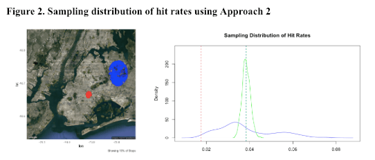
Approach 2: Fixed Stops Approach
Our second approach takes the population density into account by fixing the total number of stops. We randomly select 1,000 points as centroids from all five boroughs, draw circles around them and increase radius of each circle until each of them contains the same number of stops as the high-concentrated circle (approximately 7,000 stops). We calculate hit rate of each circle and obtain a sampling distribution (blue distribution). As shown in Figure 2, the red circle is still the high-concentrated circle, and the blue circle is one of the 1,000 circles whose centroid has been randomly selected and contains approximately 7,000 stops.
Based on the sampling distribution of hit rates in Figure 2, hit rate of the high-concentration area is still lower than that of the sampling distribution and the true mean hit rate of the entire area (~0.04). Compared to the sampling distribution obtained from the fixed radius approach, the sampling distribution obtained here has a narrower range, because we are less likely to get extreme hit rate outliers with a fixed number of stops in each circle.
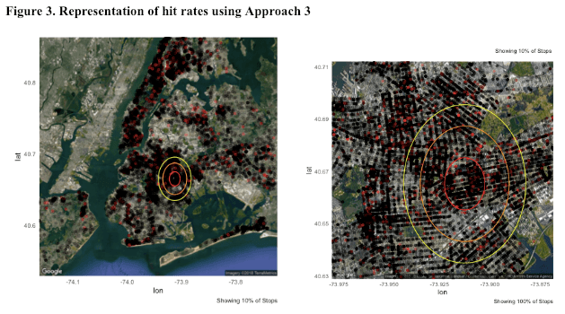
Approach 3: “Doughnut” Approach
Our last approach takes demographic and geographic characteristics into consideration. We assume areas that are very close to each other share similar demographic and geographic characteristics. Under this assumption, we draw circles around the high-concentrated area and call them the Doughnut areas. Since they are very close to the high-concentrated circle, we assume that they share similar demographic and geographic characteristics.
As shown in Figure 3, we draw an orange circle outside the high-concentrated circle, and we make sure that there are approximately 7,000 stops within that orange circle but outside the red circle. Similarly, we then draw a bigger yellow circle and make sure that there are still approximately 7,000 stops within that yellow circle but outside the orange circle. Now we have three areas with the same number of stops (approximately 7,000): the red high-concentrated circle, the orange doughnut area, and the yellow doughnut area. Since we assume these areas to have similar demographic and geographic characteristics, we expect them to have similar hit rates. However, hit rate of the red high-concentrated circle is much lower than that of the other two doughnut areas: the red circle has a hit rate of 0.017, the orange doughnut area has a hit rate of 0.041, and the yellow doughnut area has a hit rate of 0.032. This could be a piece of evidence showing NYPD police officers are not conducting SQF effectively, as they conducted the most number of stops within the red circle but yielded the lowest hit rate among the three areas.
Conclusion
Using scan statistics, we were able to identify five circular areas within each borough with the most SQF stops. The results of our three spatial analytic approaches indicate that the hit rate of the area with the most SQF stops in 2013 was significantly lower than the mean hit rate of other areas. This suggests a need for further investigation into whether the NYPD is using its resources effectively.
Limitations
A major limitation of our analysis was our inability to consider the counter argument that the lower hit rates in areas with a higher frequency of stops is evidence of the efficacy of hot spot policing. Essentially, some claim that targeting high crime neighborhoods with increased surveillance and threat of being stopped discourages individuals from carrying weapons and contrabands. It is also possible that people who are likely to carry weapons or contrabands become aware of and avoid areas with higher likelihood of being stopped. In addition, our study likely underestimates the actual number of stops in each neighborhood due to inaccurate or incomplete reporting by officers.
When determining the high-concentration circle, we didn’t account for bodies of water, parks, cemeteries, or other areas without people. It is also possible that the area with the highest concentration of stops represents an outlier; therefore our results may not be generalizable. An alternative approach we could have taken is to create a sampling distribution of 10% of identified hot spots. In our third approach, we use the doughnut method to compare the hit rate in nearby areas with comparable demographic and neighborhood characteristics. However, this method is limited because it assumes isotropy. Instead of this approach, we could have used random points on the border of the high-concentration circle as centroids to create a Spirograph. This may have resulted in larger areas with more similar characteristics and better approximated the sampling distribution of neighbors.
Code and Data
Our code is available on the github repository (https://github.com/chansooligans/spatial_project).
- Main code: The file “Spatial_Project.Rmd” is the master code.
- Shiny Apps: Each of the “Spatial_Shiny_App” folders contain a .R file. These are the R Shiny Apps that were used to demonstrate simulations. Simply open then click “Run” to run the app.
- Code to Identify Circles with Highest Concentration: To identify circles with highest concentration, I had to compute very large distance matrices. In order to use the HPC Clusters, separate .R files were created: “parallel_dist_spacial.R” and “parallel_dist_spacial_bk.R”. A separate script was used for Brooklyn because Brooklyn has many stops.
