Introduction:
A key challenge in the application of propensity scores for matching is that the propensity score is unknown and must be estimated. To make matters worse, slight misspecification of the propensity score model can lead to substantial biases in treatment effects. This has led to researchers iteratively re-estimating the propensity score model, subsequently checking the resulting covariate balance, then repeating over and over until they are satisfied. Imai et al (2008) calls this the ‘propensity score tautology’: the estimated propensity score is appropriate if it balances covariates.
In this simulation study, I analyze two approaches that seek to bypass this ‘propensity score tautology’: Covariate Balancing Propensity Score and Entropy Balancing. Each method obviates the need for iteratively re-estimating the propensity score model and checking balance on the covariate moments. That is, a single model is used to estimate both the treatment assignment mechanism and the covariate balancing weights.
Matching and Propensity Scores:
In an observational study setting where the confounding covariates (variables correlated with both treatment and outcome) are known and measured, we may use matching methods to ensure that there is sufficient overlap and balance on these covariates. Then, we can estimate the treatment effect using a simple difference in means or regression methods.
Overlap is important because we want to make sure that for each treated or control subject in the study, there exists an empirical counterfactual (this criteria varies depending on the estimand of interest, i.e. to estimate the ATT it is sufficient to have empirical counterfactuals for just the treated subjects in the study). Balance on the covariates is important because imbalance would force us to rely more on the correct functional form of the model.
There are many different matching methods, but the driving principle is to identify observations that are “most similar”, based on some distance metric. Methods include K-nearest-neighbor, caliper-matching, kernel-matching, Mahalanobis matching, Genetic Matching, Optimal Matching.
A propensity score is a one-number summary of the covariates. Rosenbaum and Rubin (1983) define the propensity score for participant i as the conditional probability of treatment assignment (

If strong ignorability holds after conditioning on the propensity score, that is:

After using either matching, propensity scores, or both to obtain a subset of the data that exhibits sufficient overlap, simple mean differences or a linear regression using weights can be used to estimate the treatment effect (ATE, ATC, or ATT). In all cases, ignorability, sufficient overlap, appropriate specification of the propensity score model / good balance, and SUTVA are all important assumptions to obtain unbiased estimates of the treatment effect. The Stable Unit Treatment Value Assumption (SUTVA) states that the potential outcomes are independent of the particular configuration of treatment assignment. That is, there are no diluting or concentrating effects.
To summarize assumptions, propensity score and matching methods require that the structural assumptions of ignorability and SUTVA are met. And to a lesser degree make parametric assumptions: correct specification of the propensity score model. Theoretically, in some cases, sufficient overlap and balance may make the outcome estimation model robust to misspecification and thereby helps to relax the parametric assumptions.
Covariate Balancing Propensity Score (CBPS):
The CBPS exploits the dual characteristics of the propensity score as a covariate balancing score and the conditional probability of treatment assignment (Imai and Ratkovic (2012))
First, consider a commonly used model for estimating propensity scores: logistic regression (point of this part is to show the dual characteristics!):

We typically estimate the unknown parameters by maximum likelihood:

And we get the ML estimates by differentiating the log likelihood with respect to the parameters then setting the derivative to zero. So differentiating with respect to 

Then, they operationalize the covariate balancing property by using inverse propensity score weighting:

where 


To estimate the CBPS, Imai uses the GMM or EL framework. For more details please see Imai and Ratkovic (2014).
Entropy Balancing:
Entropy balancing similarly involves a reweighting scheme that directly incorporates covariate balance into the weight function (Heinmueller 2015). To do this, entropy balancing searches for a set of weights that satisfies the balance constraints, while trying to keep the distribution of weights as uniform as possible (i.e. minimizing the divergence of distribution of weights from a uniform distribution). Thus, entropy balancing (1) allows us to obtain a high degree of covariate balance (using balance constraints that can involve the first, second, and possibly higher moments of the covariate distributions as well as interactions). And (2) allows for a more flexible reweighting scheme that seeks to retain as much information as possible. For example, nearest neighbor matching may discard subjects that are not matched (i.e. set weight equal to 0).
Consider the reweighting scheme to estimate the Average Treatment Effect on the Treated (ATT). We would want to estimate the counterfactual mean by:
![E[\widehat{Y(0)|Z=1}] = \frac{\sum_{i|Z=0}Y_iw_i}{\sum_{i|Z=0}w_i}](https://s0.wp.com/latex.php?latex=E%5B%5Cwidehat%7BY%280%29%7CZ%3D1%7D%5D+%3D+%5Cfrac%7B%5Csum_%7Bi%7CZ%3D0%7DY_iw_i%7D%7B%5Csum_%7Bi%7CZ%3D0%7Dw_i%7D&bg=ffffff&fg=000000&s=0&c=20201002)
where 
The weights are chosen by the following reweighting scheme:
where 


Minimize 

with 


and 


Comparison and Implementation:
Both methods may be used to estimate either the ATT, ATC, or the ATT, and the two methods are very similar. The key difference is that entropy balancing bypasses the ‘propensity score tautology’ by ignoring the propensity score model estimation step. Instead, it looks for weights that achieve the best balance, subject to a constraint that seeks to retain as much information in the data as possible. In contrast, covariate balancing directly exploits the dual characteristic to estimate propensity scores AND balance covariates simultaneously.
For implementation, I use the ‘ebal’ and ‘CBPS’ packages in R to implement Entropy Balancing and Covariate Balancing Propensity Score, respectively.
Simulation Set Up:
Features:
In this section, I examine whether the CBPS or Entropy Balancing methods improve upon the performance of baseline approaches to both (1) achieving balanced covariates and (2) estimating the treatment effect. The baseline approach estimates include (1) propensity scores using logistic regression and matches using 1-1 matching with replacement and (2) mahalanobis matching with replacement.
Though ignorability may be the most crucial assumption, I assume that all of the confounders are known to the researcher for all simulations. I believe that testing the sensitivity to the ignorability assumption would be more interesting when comparing propensity score and matching methods to other causal inference models. Since the authors of CBPS and EB claim that these models are less dependent on correctly specification compared to traditional propensity score approaches, I’m most interested in:
- reliance on the correct specification of the propensity score model
- reliance on the correct specification of the outcome model
- reliance on the ellipsoidally symmetric shape of covariate distributions
It’s clear from earlier discussion why reliance on correct specification is important. I add feature (3) because Mahalanobis distance and propensity score matching may make balance worse if the covariates are not EPBR (equal percent bias reducing). But both methods are equal percent bias reducing if all of the covariates used have ellipsoidal distributions (e.g. multivariate normal).
Estimand:
The estimand of interest is the ATT: Average Effect of Treatment on the Treated. The ATT tells us how much the treatment affected the group of subjects that receieved treatment. We estimate the ATT by comparing the observed outcomes to the counterfactual outcomes that we would have measured had this group of subjects not received treatment. But since we are not able to observe this counterfactual state, we match each of these treated individuals to a control subject.
Data Generating Process:
I consider four data generating processes:
- Standard Normally Distributed Covariates: The pre-treatment covariates
are four independent and identically distributed random variables following a standard normal distribution. The true propensity score model is a logistic regression whose linear predictor is a linear transform of the pre-treatment covariates.
- Standard Normally Distributed Covariates (non-linear propensity score model): The pre-treatment covariates are the same as Simulation #1; however, the true propensity score model is a logistic regression whose linear predictor are non-linear transforms of the pre-treatment covariates:
- Standard Normally Distributed Covariates + 3 count covariates: The pre-treatment covariates
consist of four independent and identically distributed random variables following a standard normal distribution, a random variable following a poisson distribution with
, the negative values of a random variable following a binomial distribution with
and
, and a random variable following a chi-squared distribution with
.
- Standard Normally Distributed Covariates + 3 count covariates (non-linear propensity score model): The pre-treatment covariates are the same as Simulation (5); however, the true propensity score model is a logistic regression whose linear predictor are non-linear transforms of the pre-treatment covariates:


I run each DGP twice, for a total of 8 simulations. For the first set of four simulations, the true outcome model is a linear regression with the pre-treatment covariates as predictors. For the second set of four simulations, the true outcome model is a linear regression with non-linear transformations of the pre-treatment covariates as predictors. I use the following non-linear model:

Matching Methods:
Here, I briefly review the baseline models, then the specific specifications of the CBPS and EB models used in this simulation. For all six methods, the target estimand is the ATT and I match accordingly (that is, treated subjects receive weights equal to one and control subjects receive adjusted weights).
- Baseline: Propensity Score using Logistic Regression:
- Baseline: Mahalanobis Matching
- CBPS (1)
- CBPS (2)
- EB (1)
- EB (2)
The first baseline model uses logistic regression (without any interactions or transformations) to estimate propensity scores. I match using 1-1 nearest neighbor matching using the propensity scores.
The second baseline model uses Mahalanobis matching. Mahalanobis calculates distance as 
The third and fourth models use CBPS: an over-identified model and a just-identified model. The over-identified model (#3) combines the propensity score AND covariate balancing conditions. The just-identified model (#4) only contains covariate balancing conditions.
The fifth and sixth models use Entropy Balancing: one that achieves balance on just the first moment (#5) and one that achieves balance on both first and second moments (#6).
For all 6 models, I use a linear regression using (1) weights to reflect the restricted dataset of the corresponding matching method and (2) all observed covariates (without any interactions or transformations) to estimate the ATT.
Simulations:
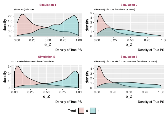
The above plots show the density of the true propensity score in treatment and control groups for each simulation. There is a misleading pattern: the linear propensity score models (#1 and #3) have strong separation, whereas the non-linear propensity score models (#2 and #4) show a platykurtic treatment distribution with positively skewed control density. However, this is totally arbitrary and is reflective of the specification of the true propensity score model. But this is ok because I’m interested in comparing the relative performances of the models given a simulation.
Examine Overlap of Propensity Score and Covariates (Before Matching):

Analysis of Mean Differences:
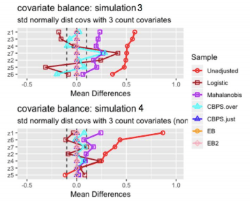
- Entropy balancing shows the best performance with respect to balancing covariate means. For all 4 simulations, the standardized mean difference is approximately zero for all covariates.
- The CBPS just-identified model similarly achieves perfectly balanced covariate means.
- The CBPS over-identified model performs significantly better in simulations where the true propensity score model is non-linear and worse in simulations where the true propensity score model is linear, which seems counter-intuitive. In fact, for both simulations with a non-linear true propensity score model, the CBPS over-identified model achieves nearly 0 mean difference for all covariates, where as mean differences remain large for both simulations with linear true propensity score model. One observation is that when the true propensity score model is linear, the covariates’ mean differences are similar to the covariates’ mean differences under the logistic model. Recall that the over-identified model combines the propensity score and covariate balancing conditions whereas the just-identified model only contains covariate balancing conditions. It seems likely that when the true propensity score model is linear in the covariates, the propensity score condition “dominates” the covariate balancing conditions, so the CBPS over-identified model’s performance resembles the logistic baseline model’s results. For the simulations with a non-linear propensity score model, the propensity score condition no longer dominates, so the CBPS over-identified model’s performance resembles the just-identified model’s results.
- The logistic regression and mahalanobis matching methods show strong performance in simulation 1, where the pre-treatment covariates have standard normal distributions. Performance appears to weaken after including count variables and when the true propensity score model is non-linear.
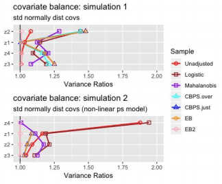

Analysis of Variance Ratios:
The Entropy Balancing model where I have set both first and second moment conditions (EB 2) is the only model that consistently achieves variance ratios = 1. The other models’ ability to obtain similar variances of matched samples across treatment groups is rather sporadic.
Results:
Below, the first three tables display results from the 4 simulations for which the true outcome model is linear. The latter three tables show the equivalent results, except with a non-linear true outcome model. I also plot these tables so that it’s easier to visually inspect model results across simulations.
Caution: we should only compare models (columns) given a row (simulation). For example, based on Table 3, it is incorrect to claim that “Simulation #2 (multivariate normal covariates with misspecified propensity score model) has lower RMSE than Simulation #1 (multivariate normal covariates with correctly specified propensity score model)”. This result can quickly be reversed by changing the specification of the true propensity score model. Rather, we are interested in how the models’ performances (e.g. CBPS 1 vs EB-1) given a simulation.
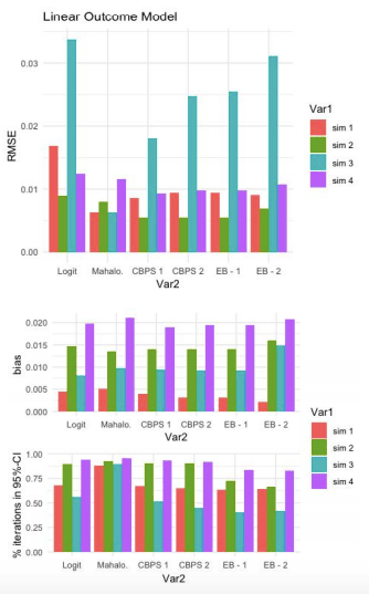
Linear Outcome Model:
For this first set of simulations, Mahalanobis has the lowest RMSE for 2 out of 4 simulations. Both of these simulations have a linear true propensity score model. When the true propensity score model is non-linear (#2 and #4), Mahalanobis does better than Logit but worse than CBPS and EB.
All models do better than the baseline logit model (keeping in mind that this baseline model made no attempt to improve the propensity score estimation model).
Comparing CBPS and EB, the over-identified CBPS model (CBPS 1) either ties or out-performs the other specifications of CBPS and EB. CBPS does better when it exploits the dual specification (over-identified) than when it solely balances covariates (just-identified).
As cautioned above, these plots do not suggest that CBPS and EB models underperform for Simulation #3. Simulation #3 is equivalent to #4, except that the true propensity score model is LINEAR for #3 and NON-LINEAR for #4. So the expectation (all else equal) would be that the models would perform better when the true propensity score model is linear. But all else is NOT equal, the DGP (i.e. distributions of the true propensity scores) differ across simulations.
The third graph shows the percentage of iterations in which the true SATT (Sample Average Treatment Estimate on the Treated) falls inside the 95% confidence interval of estimated SATT. These results are much more discouraging for CBPS and EB. They appear to trivially improve upon the baseline logit model (if at all) and for simulations #1 and #3, perform much worse than the Mahalanobis estimate.

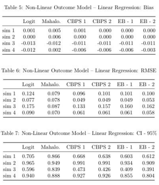
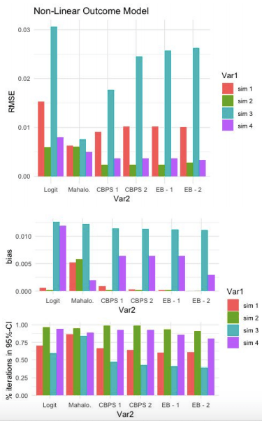
Non-Linear Outcome Model:
Comparison of RMSE results in the same patterns as the Linear-Outcome case above. Mahalanobis does better the other models when the true propensity score model is linear. With a non-linear true propensity score model, CBPS and EB both achiever lower RMSE than Logit and Mahalanobis. Once again, the CBPS-1 model does at least as well as any of the other CBPS or EB models.
Similar to the previous result, CPBS and EB do not appear to do much better than Logit with respect to % of iterations capturing true SATT within a 95% confidence interval of estimated SATT.
References:
- Diamond, A. and Sekhon, J. 2012. Genetic matching for estimating causal effects: a new method of achieving balance in observational studies.
- Hainmueller, Jens. 2012. “Entropy Balancing for Causal Effects: A Multivariate Reweighting Method to Produce Balanced Samples in Observational Studies.” Political Analysis 20(1): 25–46.
- Imai, K., King, G. and Stuart, E. A. 2008. Misunderstandings between experimentalists and observationalists about causal inference. J. R. Statist. Soc. A, 171, 481–502.
- Imai, Kosuke, and Marc Ratkovic. 2014. “Covariate Balancing Propensity Score.” Journal of the Royal Statistical Society: Series B (Statistical Methodology) 76(1): 243–63.
- Rosenbaum, Paul R. and Donald B. Rubin. 1983. “The Central Role of the Propensity Score in Observational Studies for Causal Effects.” Biometrika 70 (1): 41–55.
- Rubin, Donald B. 1976a. “Multivariate Matching Methods That are Equal Percent Bias Reducing, I: Some Examples.” Biometrics 32 (1): 109–120.

 and
and  .
.  , so we would expect that NYPD stop more people carrying weapons or contraband. On the other hand, an officer may have a lower threshold in a high crime area. Thus, an officer may stop individuals in a high crime area who otherwise may not have been stopped in a low crime area. For these individuals, the probability of a hit would be low even though the stop was conducted in a high crime neighborhood.


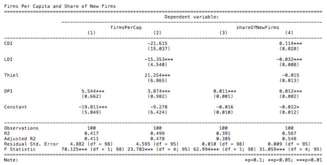
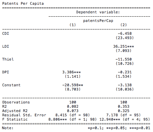
 is the level of new firm formation in region i. A new firm is defined as a business aged between 0 to 1 years and consisting of fewer than 9 employees.
  is the diversity measure in region i. The error term,
  , captures the effect of an incorrect functional form, the effects of omitted variables, and the measurement errors.